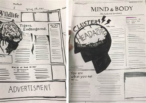
When it comes to creating newspaper illustrations, minimalism is a fantastic approach. Drawing minimalist newspaper illustrations means we focus on simplicity and clarity, allowing our messages to shine through without unnecessary distractions. In this article, we’ll explore some handy tips to help you create effective minimalist illustrations that grab attention and communicate ideas clearly. So, let’s get right in!
Understanding Minimalism in Illustration
Before we get started, let’s talk about what minimalism really means in the context of illustration. Minimalism is all about reducing our artwork to its essential elements. Instead of filling the page with lots of details, we aim to convey powerful messages with just a few simple shapes and lines. This not only makes our illustrations easier to understand but also gives them a strong emotional punch. When you draw minimalist newspaper illustrations, your goal is to highlight what really matters!

1. Choose a Strong Concept
One of the first things to do is choose a strong concept. Think about what you want your illustration to say. A clear idea is the backbone of any good minimalist illustration. Whether it’s a thought-provoking opinion piece or a light-hearted news story, make sure your concept reflects the main theme. By zeroing in on one central idea, you’ll create artwork that resonates with readers.
2. Use Simple Shapes
When we draw, using simple shapes is key. Basic forms like circles, squares, and triangles can effectively represent complex ideas. For instance, a circle can symbolize unity, while a triangle might suggest change. By combining these shapes, you can create recognizable symbols that don’t overwhelm your audience. Remember, simplicity is your friend when it comes to drawing minimalist newspaper illustrations!
3. Limit Your Color Palette
Another important tip is to limit your color palette. Choose just two to four colors that work well together. Sticking to fewer colors creates a cohesive look and strengthens the overall impact of your illustration. Plus, using contrasting colors can draw attention to specific elements, making your artwork even more engaging. A limited color palette allows the message of your illustration to stand out.
4. Focus on Composition
Now, let’s talk about composition. How you arrange your elements matters a lot! A well-balanced composition guides the viewer’s eye and enhances your message. Don’t forget to use negative space—those empty areas around and between your subjects. Negative space creates a sense of openness and directs focus to the important parts of your illustration. A thoughtful composition can make a huge difference.
5. Embrace Negative Space
Embracing negative space is a big part of minimalist design. By leaving some areas empty, you can emphasize your main subject and create balance in your illustration. Negative space can evoke emotions and invite viewers to engage with your work on a deeper level. It’s like breathing room for your illustration, allowing the viewer to take it all in without feeling overwhelmed.
6. Utilize Line Quality
The quality of the lines you use is crucial too. Clean, bold lines can clearly define your shapes, while varying the thickness can add depth and interest. For example, you might use thicker lines for the main subject and thinner lines for details. This technique creates a dynamic effect and helps highlight important aspects of your illustration.
7. Keep Text to a Minimum
In minimalist illustrations, less is definitely more. Try to keep text to a minimum, letting the visuals do the talking. When you do include text, make sure it complements the illustration without stealing the spotlight. A simple caption or a few keywords can enhance the message, but prioritize the visual elements. The goal is to create a powerful illustration that speaks for itself.
8. Experiment with Styles
Don’t be afraid to experiment! While minimalism has its own aesthetic, trying out different styles can lead to unique results. You might mix flat colors with subtle textures or combine geometric shapes with organic forms. This experimentation allows you to develop your own voice as an illustrator while still sticking to a minimalist approach.
9. Seek Feedback
Getting feedback is essential for growth. Share your minimalist newspaper illustrations with friends, peers, or mentors to gather their thoughts. Constructive criticism helps you identify areas for improvement and refine your techniques. Engaging with the artistic community can provide fresh perspectives and spark new ideas. Plus, it’s always nice to hear what others think!
10. Practice Regularly
Finally, practice makes perfect! The more you draw, the better you’ll become at creating minimalist illustrations. Set aside time each week to sketch, focusing on different concepts and techniques. Regular practice helps you develop your skills and discover new ways to express yourself through minimalist art.
Conclusion
In summary, drawing minimalist newspaper illustrations can be an incredibly rewarding process. By focusing on strong concepts, using simple shapes, and embracing negative space, you can create powerful visuals that engage and resonate with readers. Remember, simplicity is the heart of minimalism, and with practice, you’ll master this art form in no time. So grab your sketchpad and start illustrating!