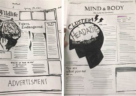
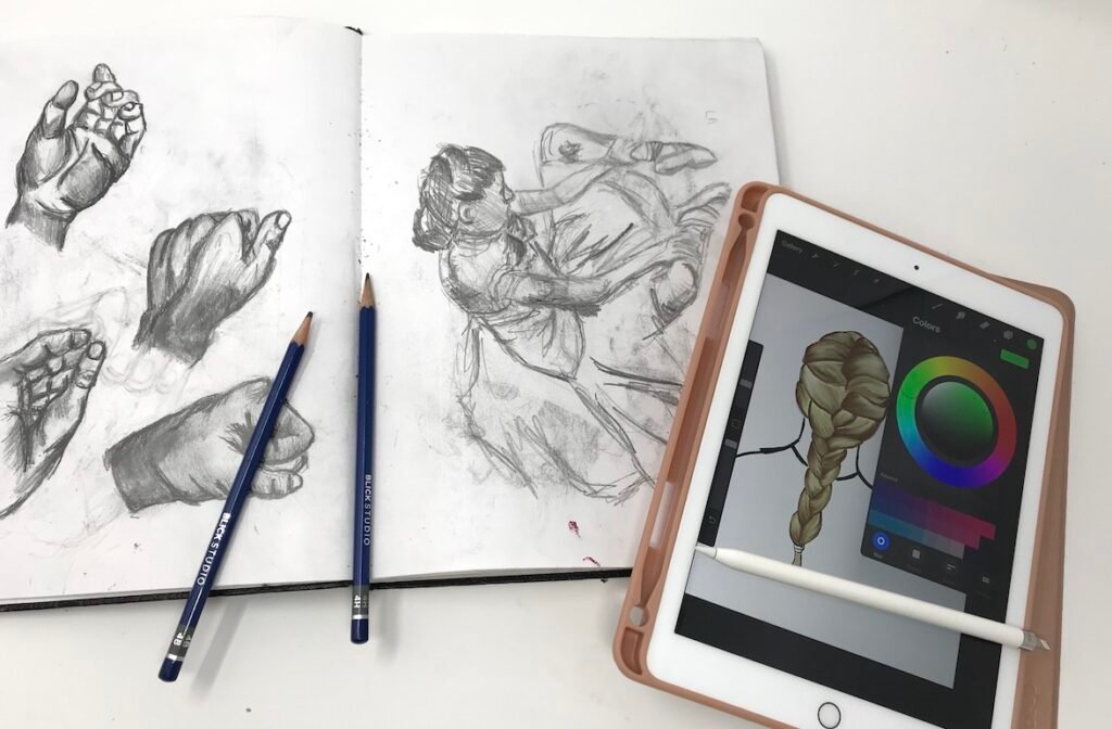
Incorporating infographics into newspaper art is a fantastic way to enhance visual storytelling and engage readers effectively. Infographics combine images, charts, and text to present complex information clearly and concisely. In this article, we’ll share essential tips for integrating infographics into newspaper art while ensuring that the content is informative and appealing.
Understand Your Audience
Before you start designing an infographic, it’s crucial to understand your audience. Knowing who will read the newspaper can help you tailor your content to their interests and preferences. For example, if your audience consists of younger readers, you might use vibrant colors and modern design elements. On the other hand, if your readers are more traditional, opt for a classic layout that is easy to read. Understanding your audience will guide your design choices and ensure your infographic resonates with them.

Choose the Right Topic
When incorporating infographics into newspaper art, selecting the right topic is essential. The subject should be relevant to your audience and the current news cycle. Consider using infographics to explain complicated statistics, summarize research findings, or illustrate trends in society. Topics that can break down complex information or highlight key points are excellent choices. A well-chosen topic will make your infographic more valuable and engaging.
Keep It Simple
Simplicity is key when incorporating infographics into newspaper art. Readers should be able to grasp the main ideas at a glance. Avoid cluttering the infographic with excessive text or complicated graphics. Instead, focus on delivering clear, straightforward information. Use simple language and concise labels to enhance understanding. Remember, an infographic should complement the written content, not overwhelm it.
Use Visual Hierarchy
Establishing a visual hierarchy is crucial in infographic design. This means organizing the information so that readers can easily navigate the content. Use size, color, and placement to highlight the most important elements. For instance, the title should be prominent, while secondary information can be smaller or less bold. A well-structured infographic allows readers to absorb information naturally, guiding them through the visual narrative.
Incorporate Data Effectively
Data is often at the heart of infographics, so it’s important to incorporate it effectively. Use charts, graphs, and icons to represent data visually. Choose the right type of visualization for the data you’re presenting. For example, bar charts work well for comparing quantities, while pie charts can illustrate proportions. Be sure to source your data and provide context so that readers can understand what the numbers mean. Incorporating accurate and relevant data will enhance the credibility of your infographic.
Choose the Right Color Scheme
Selecting an appropriate color scheme can greatly affect the effectiveness of your infographic. Colors can evoke emotions and help convey messages. For instance, using warm colors can create a sense of urgency, while cooler colors can instill calmness. Ensure that your color choices align with the topic and tone of the newspaper. Additionally, use contrasting colors to highlight important information and improve readability. A well-thought-out color scheme can make your infographic more visually appealing and effective.
Consider Typography
Typography plays a vital role in the readability of infographics. Choose fonts that are easy to read, even at smaller sizes. Sans-serif fonts are often more legible for digital formats, while serif fonts can add a touch of elegance for print. Limit the number of different fonts you use to maintain consistency and coherence. Highlight key information using bold or larger fonts, but avoid overdoing it to prevent distraction from the main message.
Make It Interactive
In today’s digital age, incorporating interactive elements into your infographics can enhance engagement. If your newspaper has a digital presence, consider using interactive features such as hover effects or clickable sections. This allows readers to explore information at their own pace, making the content more engaging. Interactive infographics can create a more immersive experience, drawing readers in and encouraging them to share the content.
Test and Revise
Before finalizing your infographic, test it with a sample of your audience. Gather feedback on the clarity, design, and overall effectiveness. Are readers able to understand the main points quickly? Does the infographic align with their interests? Use this feedback to revise and improve your design. Continuous testing and refining will help you create more impactful infographics in the future.
Promote Your Infographics
Once you’ve created and published your infographic, it’s essential to promote it. Share your infographic on social media, your newspaper’s website, and other platforms. Encourage readers to share it with their networks. The more visibility your infographic receives, the more impact it can have. By promoting your work, you not only reach a wider audience but also enhance your skills as a newspaper illustrator.
Conclusion
Incorporating infographics into newspaper art is a powerful way to communicate information effectively. By understanding your audience, keeping designs simple, and using data effectively, you can create engaging infographics that enhance your articles. Remember to consider visual hierarchy, color schemes, and typography to ensure readability. Lastly, don’t forget to promote your infographics to maximize their reach. With these tips, you can successfully integrate infographics into your newspaper art and captivate your readers.


