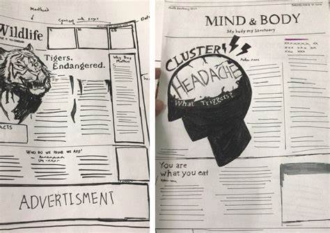
In today’s fast-paced media environment, news stories are often packed with complex data, intricate details, and technical jargon. For many readers, understanding these complicated subjects can be overwhelming. This is where illustrations come into play, acting as a powerful tool to simplify and clarify complex news stories. From financial reports to scientific breakthroughs, illustrations break down the barriers of difficult-to-understand content, making information more accessible and engaging for the audience.
Visualizing Abstract Concepts
One of the most significant ways illustrations simplify complex news is by visualizing abstract concepts. For example, when covering topics like climate change, economic trends, or public health issues, abstract data or large-scale issues can be difficult to comprehend. Illustrations like infographics, charts, and diagrams help convert these abstract ideas into tangible, easy-to-understand visuals. By distilling complicated information into simple visual representations, illustrations allow readers to grasp the key takeaways at a glance, without needing to wade through paragraphs of text.
Enhancing Reader Engagement
Illustrations help keep readers engaged, especially when the subject matter is dry or highly technical. By adding color, design, and creative visual elements, illustrations grab attention and make the news story feel less intimidating. For instance, instead of presenting raw numbers in a dry report, an infographic can present the same data through visuals such as bar graphs, pie charts, and timelines. These visuals are not only easier to digest but also far more interesting, making it more likely that readers will stay engaged with the content.
Breaking Down Complex Data
In news stories that involve large datasets—like economic reports or election results—readers are often presented with long lists of numbers or statistics. These figures can be overwhelming or hard to interpret. Illustrations such as pie charts, bar graphs, and line graphs are valuable tools for breaking down these numbers. By showing data in a visual format, readers can immediately see trends, comparisons, and relationships that would be harder to understand through text alone. This makes it easier for the audience to draw conclusions and retain information.
Simplifying Scientific and Medical News
Scientific and medical news can often be especially difficult to explain, due to the use of specialized language and complex theories. However, illustrations can help make these topics more accessible. Diagrams of biological processes, illustrations of new medical treatments, or even visualized timelines of disease outbreaks can transform an intimidating subject into something readers can easily follow. These visuals provide context and simplify difficult concepts, helping readers gain a clearer understanding of how new scientific discoveries or medical treatments work.
Providing Context to Global Events
Global events, such as natural disasters, wars, or political movements, often involve multiple layers of information that need to be explained to readers. Illustrations provide a way to break down these events into digestible pieces. For example, a map showing the geographic scope of a natural disaster or political unrest can help readers understand the event’s scale and impact. Illustrations like these make it easier for readers to comprehend the larger context of a news story, especially when they have no prior knowledge of the subject matter.

Enhancing Accessibility for Different Learning Styles
Not every reader processes information the same way. While some may prefer written content, others are more visual learners. Illustrations bridge this gap by appealing to readers who may better understand complex topics through images rather than text. Visual storytelling can complement the written content and provide an alternative way for readers to access and process information, making news stories more inclusive.
Making the News More Memorable
Illustrations not only make news easier to understand, but they also make it more memorable. Humans are generally more likely to remember information presented visually than information presented in text. By associating key ideas with images, news organizations can increase the chances that readers will retain important facts and concepts. This is particularly useful for breaking news or stories that involve data, as the visuals become a memorable takeaway.
Conclusion
Illustrations are essential in simplifying complex news stories. They provide clarity by visualizing abstract concepts, breaking down complicated data, and engaging readers in a more dynamic way. Whether it’s through infographics, charts, maps, or diagrams, illustrations enhance understanding and ensure that readers are better equipped to comprehend difficult topics. As news continues to evolve, illustrations will remain a critical tool in making complex stories accessible, engaging, and memorable for audiences worldwide.


